We have all been there. You move into a new place or finish painting your living room. You stare at that big blank drywall expanse above the couch, feeling the urge to fill it quickly. So you hop onto a big online marketplace and buy a cheap multi-pack of digital art prints.
Three weeks later, reality hits. The glossy poster paper begins to buckle and curl under the cheap plastic cover. The generic botanical prints look like they came out of a doctor waiting room. Every time the morning sun hits the glass, you see glare instead of art.
Art should make you pause when you enter the room. It should spark a feeling. It should make a guest lean forward with a drink in hand and ask where you found it.
You do not need to spend ten thousand dollars at a private gallery to get that feeling. You just need to understand what makes wall pieces look expensive in real homes.
What Makes Wall Art Look Cheap vs Expensive?
Interior designers know a secret that furniture retailers rarely explain. It is almost never the subject matter of the painting that gives away the price tag. It is the depth and physical weight.
1. Flat Paper vs Real Physical Depth
Cheap art is flat. A laser printer rolls ink onto 80-pound poster paper. When light hits it, nothing happens.
High-end art has three dimensions. Metal wires cast small shadows onto the wall behind them. Oil or acrylic brushstrokes catch edge-light from your floor lamp. When you look at the wall from the side as you walk past, the artwork changes. That shadow play instantly tells your brain that the piece is authentic.
2. Cheap Plastic Frames vs Rich Textures
If your frame is made of ultra-light plastic with flimsy bendable tabs, it will always look temporary.
Upscale pieces use substantial materials: brushed warm brass, heavy wood, or plush velvet wrapped frames. When the frame has real presence, the artwork inside feels twice as important.
3. Sizing Mistakes
The single biggest mistake people make is hanging a single 16x20 inch picture frame in the middle of a 10-foot living room wall. It looks like a postage stamp stuck on a billboard. Expensive-looking spaces commit to scale. They use either an oversized statement piece that commands the wall, or a carefully curated set that creates a grand presence.
4 Wall Art Pieces That Command Real Attention
Here are four of our favorite pieces for adding real presence to a bare wall.
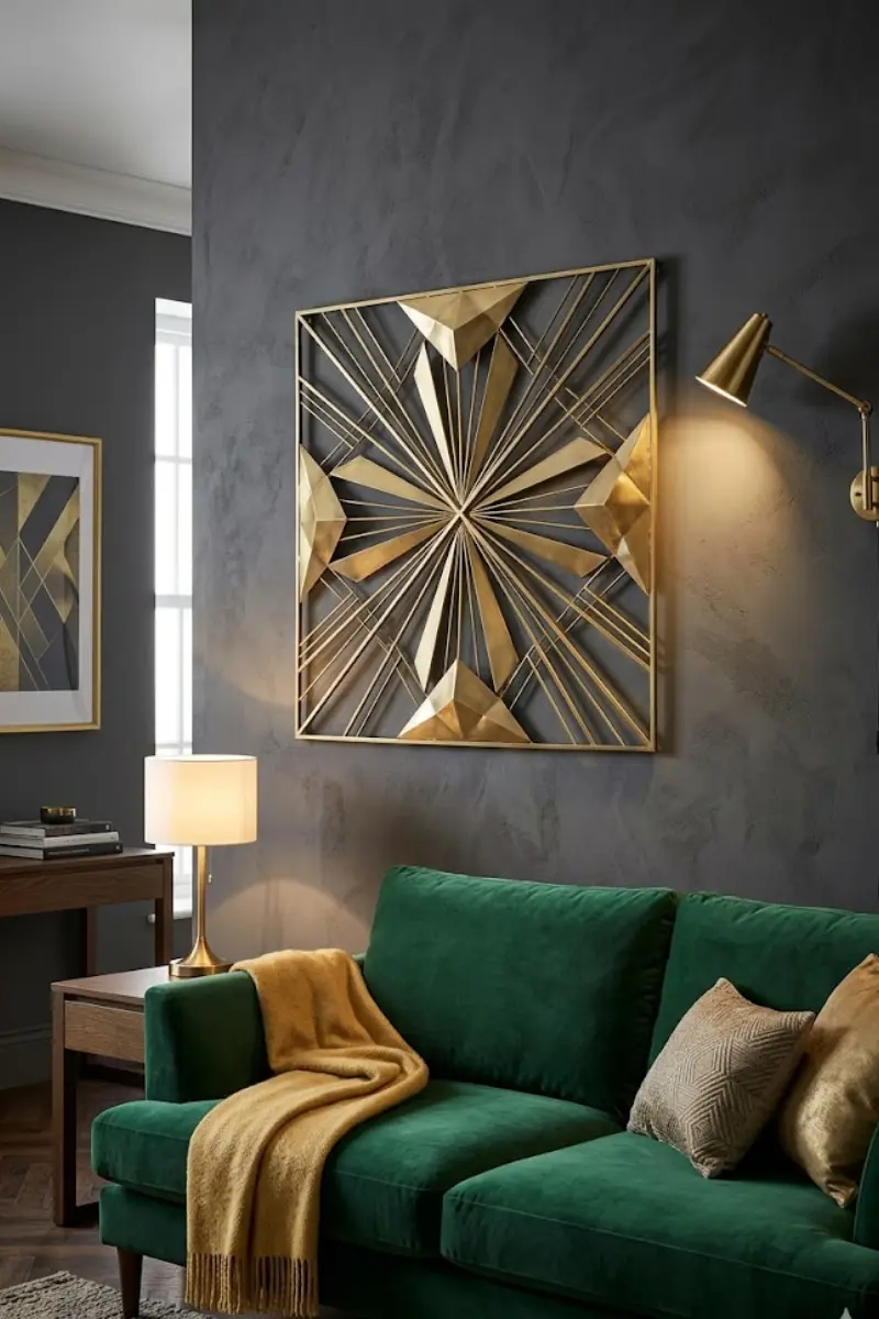
1. The Dimensional Showstopper: Art Deco Geometric Metal Wall Sculpture
Art Deco Geometric Metal Wall Sculpture
- Best for: The main living room wall directly above a sofa or media console.
- Why it looks expensive: Instead of a flat picture, this is dimensional, brass-finished metal with angular Art Deco motifs. It has visual weight without looking heavy.
- The finish: Warm brass tones bring structure and confidence to a soft, neutral living room.
- Maintenance perk: There is no glass to clean or paper to wrinkle. A quick pass with a soft dry cloth keeps it looking sharp.
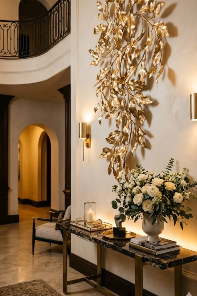
2. The Grand Hallway Piece: Champagne Gold Leaf Metal Wall Sculpture
Champagne Gold Leaf Metal Wall Sculpture
- Best for: Long hallways, double-height foyers, or the wall opposite your entryway front door.
- Why it looks expensive: The cascading gold leaf finish catches light differently through the day, so the piece never looks the same twice.
- Guest impact: Hallways are often treated as boring pass-through tunnels. Placing this grand piece at the end of a corridor turns an empty walkway into a luxury experience.
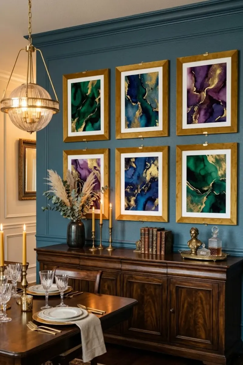
3. The Instant Gallery: Jewel Tone Velvet Framed Gallery Wall Set
Jewel Tone Velvet Framed Gallery Wall Set
- Best for: Dining room feature walls or behind a bedroom headboard.
- Why it looks expensive: Five jewel-toned abstract prints sit in gold velvet-wrapped frames, which feel far more luxurious in person than plain glass and plastic frames.
- Stress-free coordination: Sourcing five separate pieces of art that match in style and tone usually takes weeks of trial and error. This set arrives color-balanced and ready to hang together.
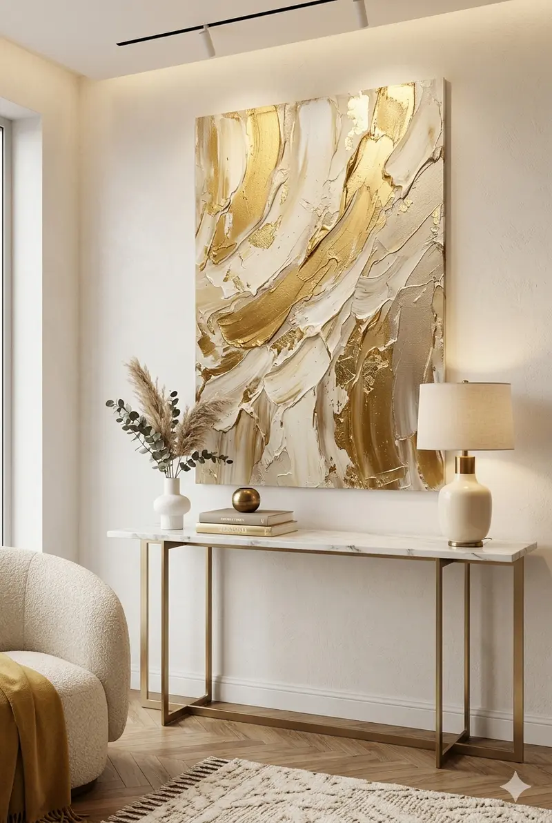
4. The Modern Minimalist: Gold Abstract Canvas Wall Art
- Best for: Contemporary apartments and minimalist living rooms wanting quiet luxury.
- Why it looks expensive: It is an oversized hand-painted canvas in gold and ivory, and the painted texture adds a depth a printed poster never can.
- Versatility: The neutral palette blends naturally with cream sofas, dark charcoal accents, and warm oak floors.
Wall Art Comparison Guide
| Art Piece | Medium & Construction | Best Location | Scale Effect | Care Method |
|---|---|---|---|---|
| Art Deco Geometric Metal | Open wrought metal construct | Above 3-seat sofa | Adds depth without heavy mass | Microfiber duster |
| Champagne Gold Leaf | Hand-finished metal petals | Entry foyer & long halls | High-drama focal point | Dry soft cloth |
| Jewel Tone Velvet Set | 5-piece velvet wrapped frames | Dining room long wall | Fills 6 to 8 feet with symmetry | Gentle lint roller |
| Gold Abstract Canvas | Stretched textured canvas | Above credenza or bed | Calm, gallery-like feel | Soft dry paint brush |
3 Professional Hanging Rules You Must Follow
Even a museum piece looks awkward if hung at the wrong height. Follow these three simple rules to make your art look like an interior designer installed it.
1. The 57-Inch Center Rule
Museum curators hang art so the exact center of the artwork sits 57 inches above the finished floor. That is the average human eye level. Do not hang art near the ceiling crown molding. When pieces sit at natural eye level, the room immediately feels grounded and balanced.
2. Follow the Two-Thirds Rule Above Furniture
When hanging artwork over a couch, headboard, or console table, the total width of the art should be roughly two-thirds (60 to 75 percent) of the furniture width below it.
- If your sofa is 84 inches wide, aim for art that spans 50 to 60 inches across.
- Hang the bottom of the frame 6 to 10 inches above the back cushion of the sofa.
3. Space Multi-Piece Sets 2 to 3 Inches Apart
If you are hanging a multi-frame gallery set, keep the gap between frames tight: exactly 2 to 3 inches. If frames are spaced 6 or 8 inches apart, your eye treats them as disconnected floating squares rather than one unified piece of art.
Frequently Asked Questions
Is metal wall art out of style?
Not at all. Cheap brass wire fan designs from decades ago are dated, but modern architectural metal art with bold geometry and matte finishes is one of the biggest trends in luxury interior design. It adds physical depth that flat prints cannot match.
How do I hang heavy metal wall art safely?
Always locate at least one wall stud if the piece weighs over 15 pounds. If hanging on hollow drywall, use heavy-duty steel toggle bolts or threaded metal anchors rated for 50 pounds or more. Never hang heavy decorative metal with cheap plastic push pins.
Should my wall art match my furniture color exactly?
No. Art that matches your sofa color exactly looks like a catalog showroom kit. Look for art that shares one or two undertones (such as the warm gold in your lamp base or the warm cream in your rug) while introducing a contrasting tone that makes the wall pop.
Add us to your preferred sources to see our latest room styling guides and luxury decor edits first in your Google feed.